E-commerce Product Listing Page (PLP) & filters redesign
Timeline
January 2024 - June 2024
Company
El Puerto de Liverpool
Context
Leading Mexican department store chain Liverpool is working to elevate their digital presence. As the product designer, I conducted a comprehensive redesign of their product listing page & filtering section on both, app and web. This involved in-depth research, competitor analysis, user testing and high-fidelity prototypes to ensure the final design adhered to industry best practices.
Problem
Liverpool has an opportunity to solidify its digital leadership in the Mexican market. However, the current digital experience, encompassing both the mobile app and website, suffers from inconsistencies. Developed incrementally over time, the app and web platform lack a cohesive design language, reflecting a mix of evolving trends that haven't been fully integrated. To address these shortcomings, we conducted a comprehensive analysis, focusing on three key areas: Product Cards, Filters, and Flash Delivery. This analysis revealed specific challenges within each module, impacting both the app and web users.
Product Card
Design inconsistencies create a visually cluttered and confusing experience
1. Visual overload on apps and wasted space on web
2. The card lacks a clear visual hierarchy due to inconsistent element sizing. As a result, the card appears disorganized.
3. Truncated product names on apps

App product card (grid mode)

Web product card (list mode)
Filters
Unnecessary Friction in Search Refinement
1. Mixing units of measurement created confusion (e.g. clothing sizes with gigabytes)
2. Untruncated filter lists overwhelmed users with options, forcing them to scroll endlessly (app)
3. Predefined options like price ranges limited flexibility (app)
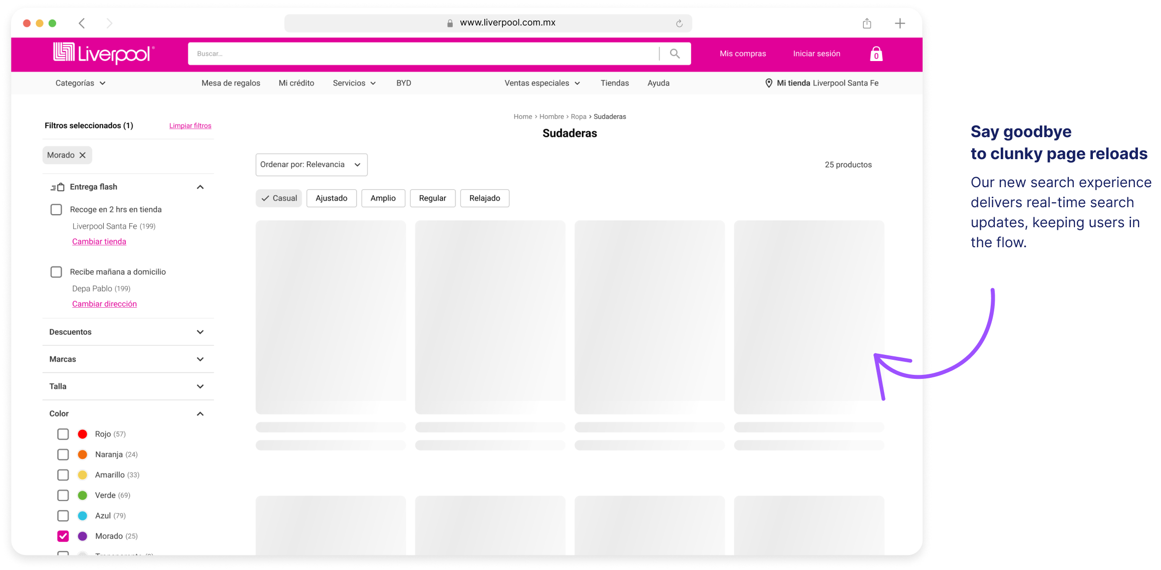
4. Selecting filters on web triggered disruptive page reloads.

Size filter

Price filter
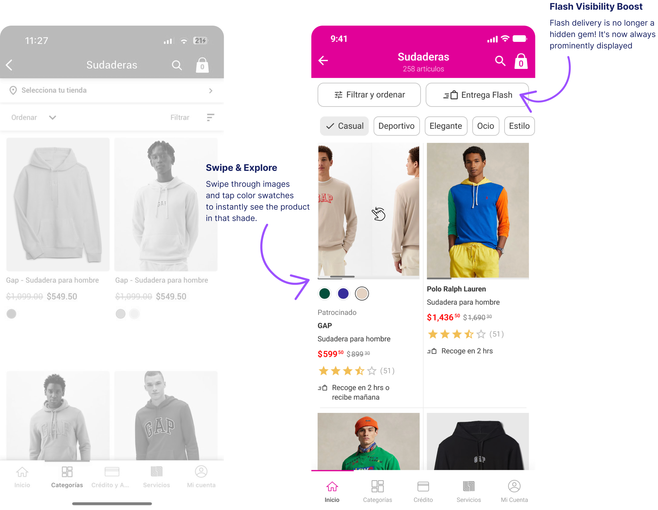
Flash Delivery
Disjointed Flash Flow
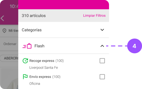
Key functionalities like store selection (1), default address (2), the Flash filter switch (3), and general filters (4) lacked clarity and were placed in separate, unrelated sections. This fragmented layout disrupted the user journey, forcing users to navigate between areas to complete basic tasks.

Product Listing Page

Addresses
Side Sheet Filters
Objectives
Frictionless Navigation & Efficiency
Users should be able to locate what they need quickly and intuitively, with essential details readily available and minimal clicks required.
Enhanced Interaction
The app should cater to evolving user needs and market trends, delivering a memorable and user-centric experience.
Clarity & Organization
The app should be user-friendly and facilitate effortless product discovery.
Unveiling Challenges: A Three-Step Analysis of Key Modules
Step 1
Understanding the Competitive Landscape and User Needs
As a product designer, it's all about understanding the landscape. To tackle Liverpool's user experience, I started by getting a grip on what users crave and what the competition is doing right. This meant digging into current e-commerce trends, like information architecture, product card sizes, and how users interact with features.The Baymard Review Tool acted as our compass in this exploration, helping us benchmark our platform against industry standards and pinpoint areas for improvement. But it wasn't just about copying others. By understanding the "why" behind successful experiences, we can craft a solution that's tailored specifically for Liverpool's unique audience and goals.

Baymard Review Tool analysis (E-commerce UX industry standard) reveals areas for improvement despite a "good" overall rating. Scores in specific areas (List Layout, Item Features & Filters) highlight opportunities to enhance user experience.
Step 2
From Research to Design Solutions
Recognizing the critical need to translate research findings into tangible solutions, we squickly turned our research on users and competitors into a series of low-to-mid fidelity prototypes. We used these prototypes as a starting point for a workshop where we discussed them with stakeholders. But it didn´t end there, we also brought the engineering team to the table early to identify potential technical hurdles. By iterating through prototypes together, we ensured user-centric design that's also feasible to build.
Step 3
Validating the Design: High-Fidelity Prototypes & User Testing
To ensure the effectiveness of our design solutions, we conducted user testing sessions with over 30 participants. These sessions utilized high-fidelity prototypes, meticulously crafted to closely resemble the final product. Following a structured, face-to-face approach with a guided testing methodology, we were able to gather invaluable user feedback. This feedback played a critical role in informing further refinements, ensuring the final design not only adheres to best practices but also resonates deeply with the needs of Liverpool's users.

A follow-up Baymard Review Tool analysis revealed a significant improvement after implementing the design recommendations. The platform's rating jumped from a "mediocre" or "good" score to "perfect" in almost all guidelines. It's important to note that while some Baymard recommendations were not implemented, these decisions were made after careful consideration to ensure the final design aligns perfectly with Liverpool's unique business goals and user base.
Before exploring the details, here's a quick look at the key design decisions that we prioritized to elevate the shopping experience:
Clean design: By removing unnecessary clutter and maximizing usable space we allowed essential elements to take center stage, enhancing the overall visual clarity and reducing distractions.
Key Info at Your Fingertips: By prioritizing the layout we ensured essential features (filters, product count and Flash Delivery) were readily visible for a smooth shopping journey.
Easier Product Exploration: The new features make finding what you're looking for a breeze.
Accessibility and Usability: Features that make a product easier to use for everyone, regardless of ability, contribute to a more inclusive design
Reimagining Liverpool´s App: Product Listing Page & Filter Redesign
Designed for Accessibility
We've analyzed factors like touch target size, color contrast, and typography size to ensure they comply with at least the WCAG 2.1 Level AA accessibility standards. This guarantees a user-friendly experience for everyone
What´s next?
Step 1
Phased Implementation
Given the project's size and ongoing initiatives, we'll implement the redesign in phases using agile development. We expect the full redesign to be available by year-end (2024).
Step 2
Development Handoff
We'll work closely with the development team to address any questions or concerns, fostering open communication and collaboration.
Step 3
Launch & Monitor
We'll continuously monitor user behavior and gather feedback to inform future iterations, refining the design based on real-world usage.